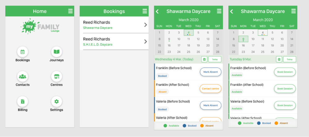
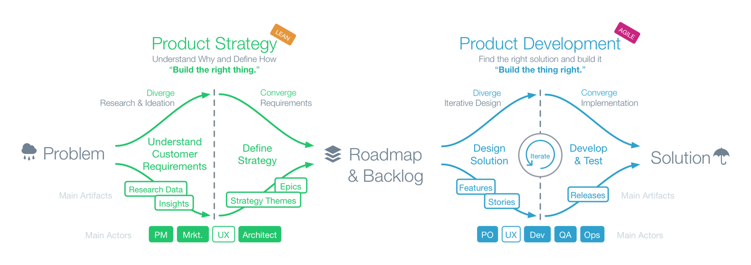
Discover
Start with internal stakeholder interviews
I spoke to Support, Sales, Delivery teams, Parents at work who were using the app to gather insights and an internal view about the app.
Validate with customers and users
I convinced the company to visit an OSHC (ie Outside of School Hours Centre) as I was hearing from internal stakeholders that these type of customers were voicing that their needs were not catered in comparison with Daycare Centres. We bribed parents at drop-off with pastries for their thoughts on booking sessions for their children amongst other things.
Define
Insights
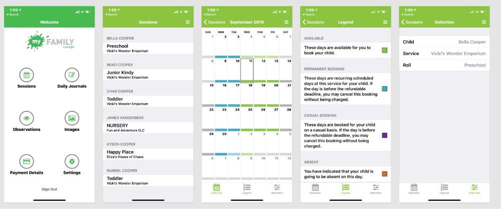
- Parents found the experience of booking, cancelling and marking absent clunky especially when they wanted to book for multiple children at the same centre
- The concept of Permanent and Casual bookings legend is internal terminology to QIKKIDS
- Primary JTBD (Jobs to be done) booking, cancelling and marking absent; contacting the centre as a last resort;
- Daycare centres found it easier to use than OSHC (ie Outside of School Hours Centres)
Initial State
Develop
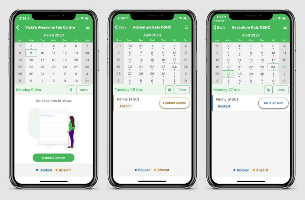
✅ Redesign the calendar to familiar calendars such as Calendar Apps native to iOS and Android; Outlook app, Google Calendar (learn more about Design Affordances)
✅ Consolidate calendar view
✅ Reduce legend (bye bye Permanent and Casual; see you later Full)
✅ Be able to see all my children at the same centre
✅ Usability test the booking experience with the primary goal of reducing the friction of booking, cancelling and marking absent.
🎉 Make it POP (...just kidding - I actually despise this phrase)
New Design

Design with Accessibility at the forefront
I strive to bake in accessibility (a11y) as much as possibile and do so my allocating time to do this. We did have team members who had a form of colour-blindness (its more common than you think). I was able to share and get feedback from them, and they were happy that I considered this aspect of design as it is usally overlooked.
I recommned this chrome extension to test for colour blindness.
Deliver
What went well
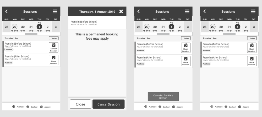
The team was able to deliver the first slice of work which was being able to:
- see existing bookings
- mark a session absent
- contact the centre after being marked absent
- Reduced friction by being able to see multiple children at the one centre was less clunky
- Feedback from colleagues; parents was positive
- Illustrations for empty states
What could be improved
- Accessibility: At delivery stage you are at the mercy of the calendar plugin that the delivery team chooses; unfortunately accessibility and customisability is limited.
Next Steps
- Seeing available sessions
- Cancelling a session
About Neil
ORIGIN STORY
I started out as a Nurse for 8 years at Coronary Care Unit and Cardiac Rehabilitation. Although I found the job rewarding it was lacking something I couldn't articulate.
Frustrated with time wasted conducting and documenting a 6-minute walk test (6MWT), I decided to build an app so I could focus more time on my patients. I taught myself how to code and design in my spare time which eventually resulted in 6MWT app.
I found that Coding and Design gave me creative freedom to solve a problem and potentially disrupt an industry.
I wanted to learn from the best cutting edge company with a big heart so I worked at ThoughtWorks as Frontend Developer (FED) and User Experience Designer (UX).
I consider my FED strengths in to be HTML, CSS (SCSS), Javascript (Typescript/Angular). I am a strong advocate for increasing confidence by writing tests and abstracting elements into reusable components. FYI I'm a self-confessed Ionic Fanboy.
I consider my UX strengths to be UI Design, Usability Testing, User interviews, Design Systems and Design Workshop facilitation. I am a strong advocate for baking in UX Methodologies from the start and thrive when I champion the UX processes within the team. I believe Design is a team sport and work best in a collaborative environment.
Ultimately, I have a passion for creating interactive applications that deliver delightful user experiences whether it's with code or design.
Download Resume