
Case study · Travel Tech
Finding the friction that actually mattered
Helio is the booking ecosystem Flight Centre consultants rely on every day. In 2021, I co-led a global research study that replaced a backlog of anecdotal complaints with a prioritised, evidence-based view of what was really costing consultants time, region by region. That research shaped the roadmap that followed, including a rebuilt refund experience and improvements across Tours & Packages.
About Flight Centre
Flight Centre Travel Group runs its retail travel business on Helio, an in-house ecosystem consultants use to search, quote, and book trips through tools like Shopping Cart, Dynamic Package, Elite Package, and Search & Book. By 2021 Helio had rolled out to consultants worldwide, but how well it actually served them, region by region, was still mostly anecdotal.
Challenge
Feedback about Helio was everywhere, but it wasn’t useful. Complaints arrived through different channels in different regions, with no consistent way to tell a widespread, high-cost problem from a loud but isolated one.
- Anecdote, not evidence: leadership had a sense that consultants were frustrated, but no structured, comparable view of where the friction actually was.
- One ecosystem, many workflows: Helio ran across very different regulatory environments and booking patterns, from Canada to Australia to South Africa, so a fix that helped one region could be irrelevant, or actively unhelpful, in another.
- Workarounds hiding the real problem: consultants had quietly built their own coping mechanisms, spreadsheets, copy-paste habits, side tools, which masked how much time Helio itself was costing them.
Research & discovery
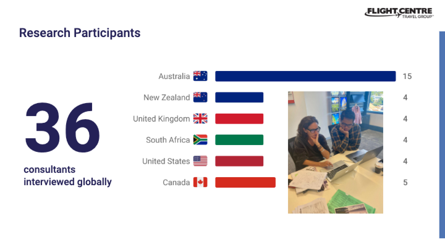
Working alongside a Product Manager and a fellow Senior UX Designer, I helped design and run a research study built around a simple idea: to find problems, talk to people. We interviewed 36 consultants across every region Helio served, in person wherever we could, to see their real workflows, not just hear about them.
- One-on-one interviews covering overall sentiment toward the new system, needs and wants, and show-and-tell observations of consultants working live.
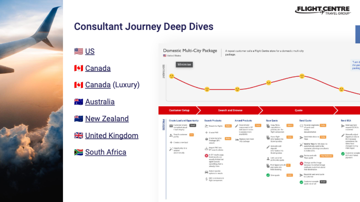
- End-to-end journey mapping of how consultants actually moved through a booking, including the workarounds they’d invented and where the real pain points and opportunities sat.
- A post-interview survey asking each consultant to rank their top 5 Helio improvements and rate the experience across several usability dimensions.
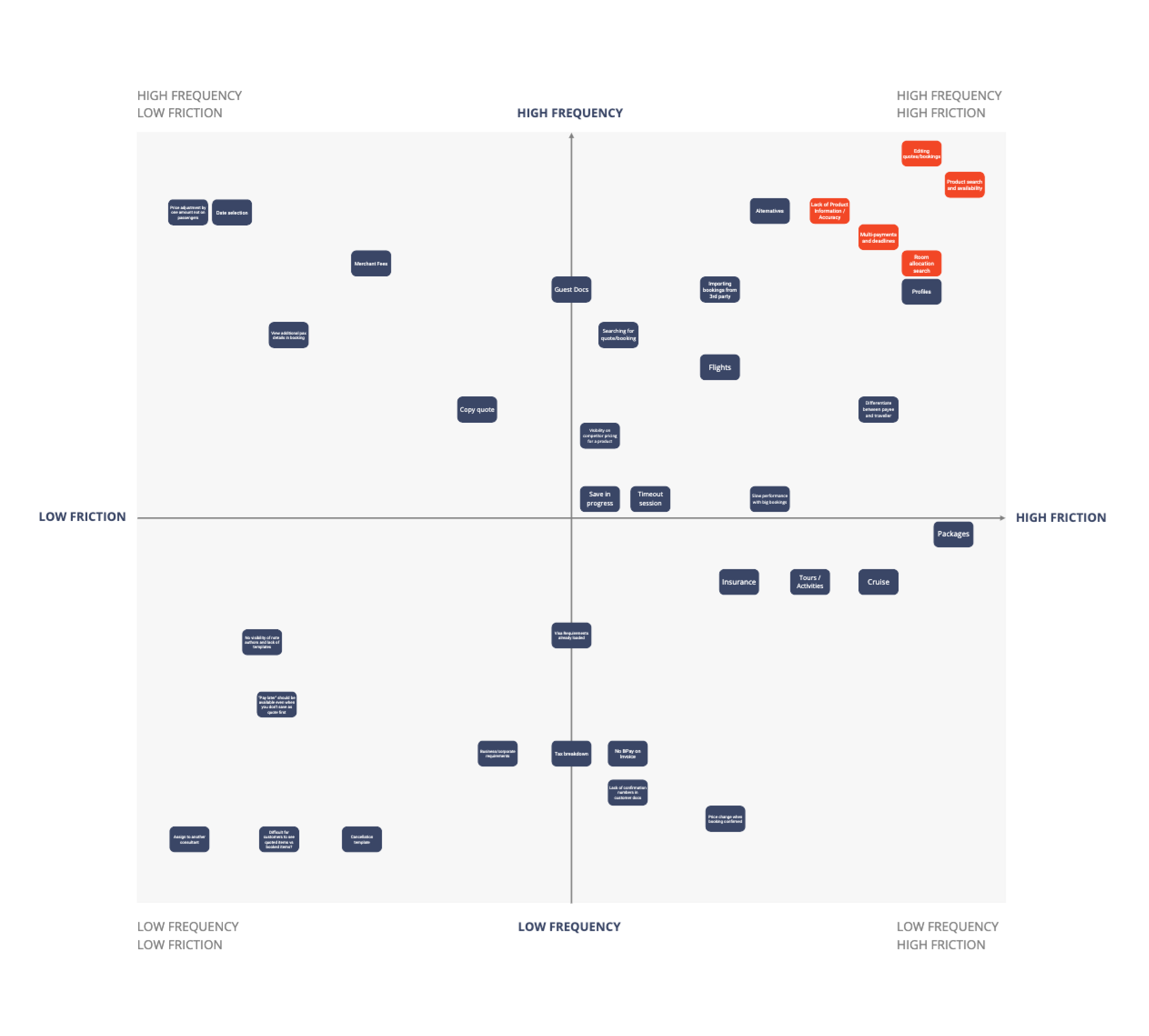
We mapped seven end-to-end consultant journeys spanning the US, Canada, Canada’s luxury market, Australia, New Zealand, the United Kingdom, and South Africa, then ran the raw feedback through a five-step synthesis process: categorise by each consultant’s own ranked priority, cluster by theme, aggregate the results, plot them on a friction-versus-frequency map, then distil that into a single, defensible Top 5.
The Top 5: what consultants told us
The same five themes surfaced everywhere, even as the details differed by region.
- Editing quotes and bookings: there was no way to edit a booking’s components, passengers, or trip name, so consultants were re-creating whole quotes from scratch for even small changes.
- Product search and availability: search behaved differently from city to city and often didn’t reflect live availability or pricing, an awkward thing to discover mid-conversation with a customer.
- Lack of information and accuracy: missing or inaccurate room names, descriptions, and locations meant consultants couldn’t sell confidently and had to double-check details directly with suppliers.
- Payments: multiple payments had to be added one at a time, waiting for a reload between each, and overdue payments had no visibility or alert.
- Multiple rooms for multiple people: searching for several rooms at once for families or groups routinely returned no results, forcing one search per room with no guarantee they’d all be available.
Regional differences mattered just as much as the shared themes. Canada had regulatory information Helio couldn’t capture, so consultants added it manually. Australian consultants relied on a separate tool, Quickdox, to search and create customer profiles. New Zealand-specific fare codes weren’t supported by Helio’s air import, so agents hand-entered flight details. US consultants leaned heavily on Dynamic Packaging, since most product was priced that way. In South Africa, the traveller and the payee were often different people, a pattern Helio didn’t handle gracefully. In the UK, consultants were competing directly against websites offering rates Helio couldn’t match.
From research to roadmap
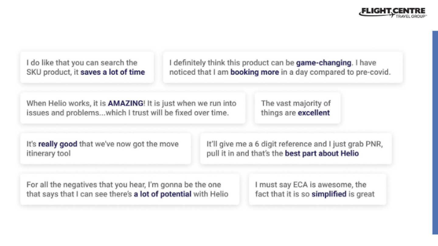
The survey also gave us a subjective usability baseline across five dimensions: ease of use, perceived productivity, customer experience, perceived speed, and NPS. The most useful finding wasn’t any single score, it was the gap between them. Consultants rated Helio reasonably easy to use, but far less confident that it made them more productive, or that customers were feeling the benefit. Usability alone wasn’t the problem; productivity and trust were.
That baseline gave the business something it hadn’t had before: a number to improve against, not just a sense that things should be better. It fed directly into a set of improvements already underway off the back of the research:
- Room descriptions and additional information, addressing the accuracy gap consultants relied on to sell confidently.
- Multiple and split payments, removing the one-at-a-time payment bottleneck.
- Visibility of overdue payments on quotes and bookings, so deadlines stopped slipping through unnoticed.
- Updates to the Grab PNR quote flow, the workflow most consultants actually used day to day.
- Displaying confirmation numbers directly, cutting out a common manual lookup.
Building on the research: refunds and Tours & Packages
The same consultant-embedded, evidence-first approach carried into two further workstreams I led. Redesigning the refund experience remains one of the projects I’m most proud of: rather than optimising the workflow in isolation, we spent time alongside consultants to understand where their confidence broke down during difficult customer conversations, not just where the process was slow. The resulting workflow reduced friction for consultants while helping them better support customers through some of the most stressful moments in their trip.
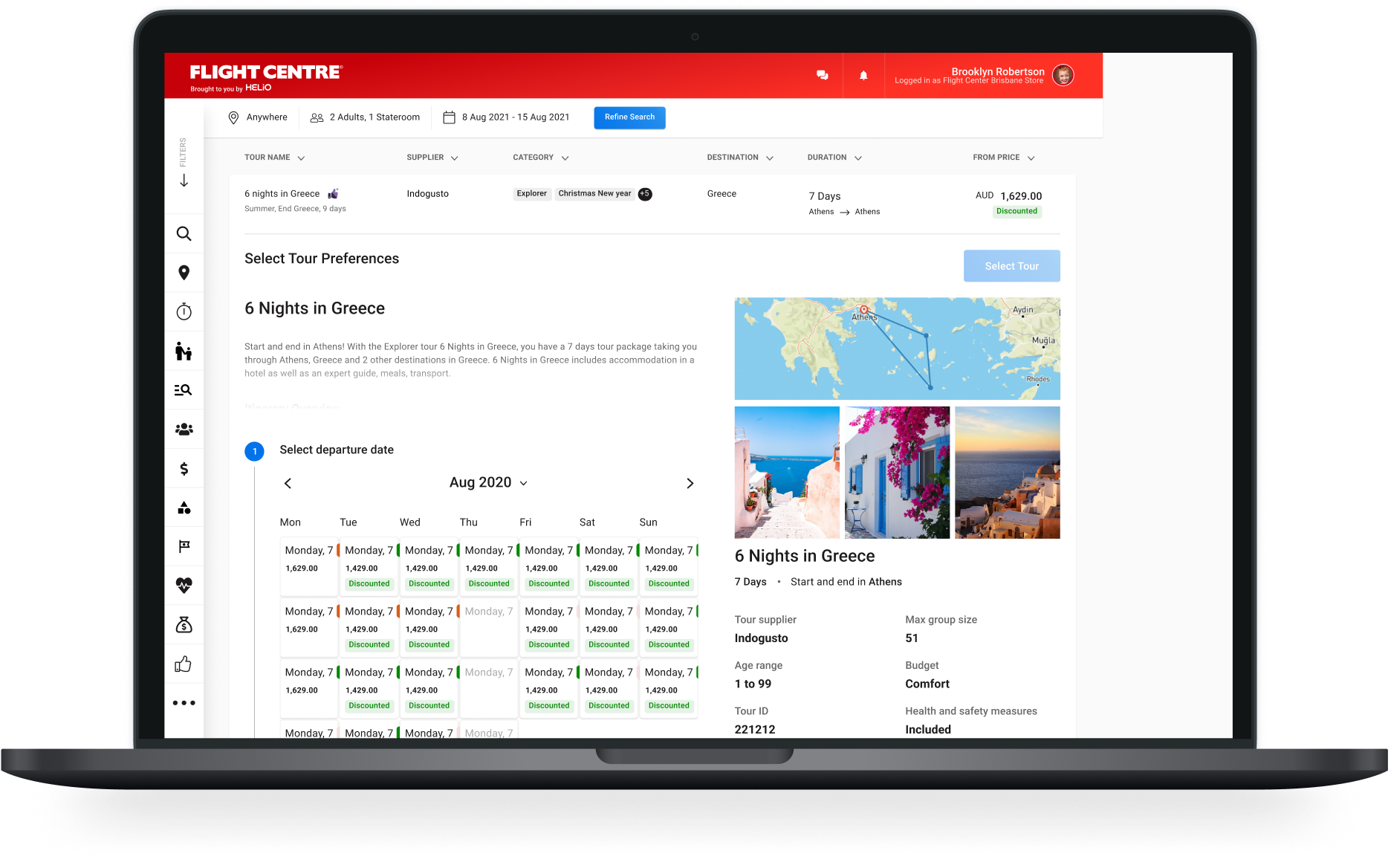
The same lens applied to Tours & Packages, where consultants assemble bundled itineraries of flights, accommodation, tours, and add-ons. Journey mapping the package-building flow surfaced the same kind of double-handling the original research had flagged around editing and search, and shaped improvements to how components came together for consultants building a trip.
Outcomes
This research turned a scattered backlog of complaints into a shared, evidence-based understanding of where Helio was really costing consultants time, and gave the roadmap that followed somewhere solid to stand on.
- A defensible Top 5 the whole business could rally behind, instead of whoever complained loudest.
- A usability baseline to track real progress against, not just a general sense of improvement.
- Five improvements already shipping as a direct result, with more informed by the same research further out.
- A repeatable approach that went on to shape the refund experience redesign and improvements to Tours & Packages.
Consultants interviewed
Across every region Helio served, not just the loudest offices.
Consultant journeys mapped
End-to-end, across the US, Canada, Australia, New Zealand, the UK, and South Africa.
Priority themes
Distilled from raw feedback into a single, defensible Top 5.