Case study · Data Visualisation
Captivating the nation with a live electorate map
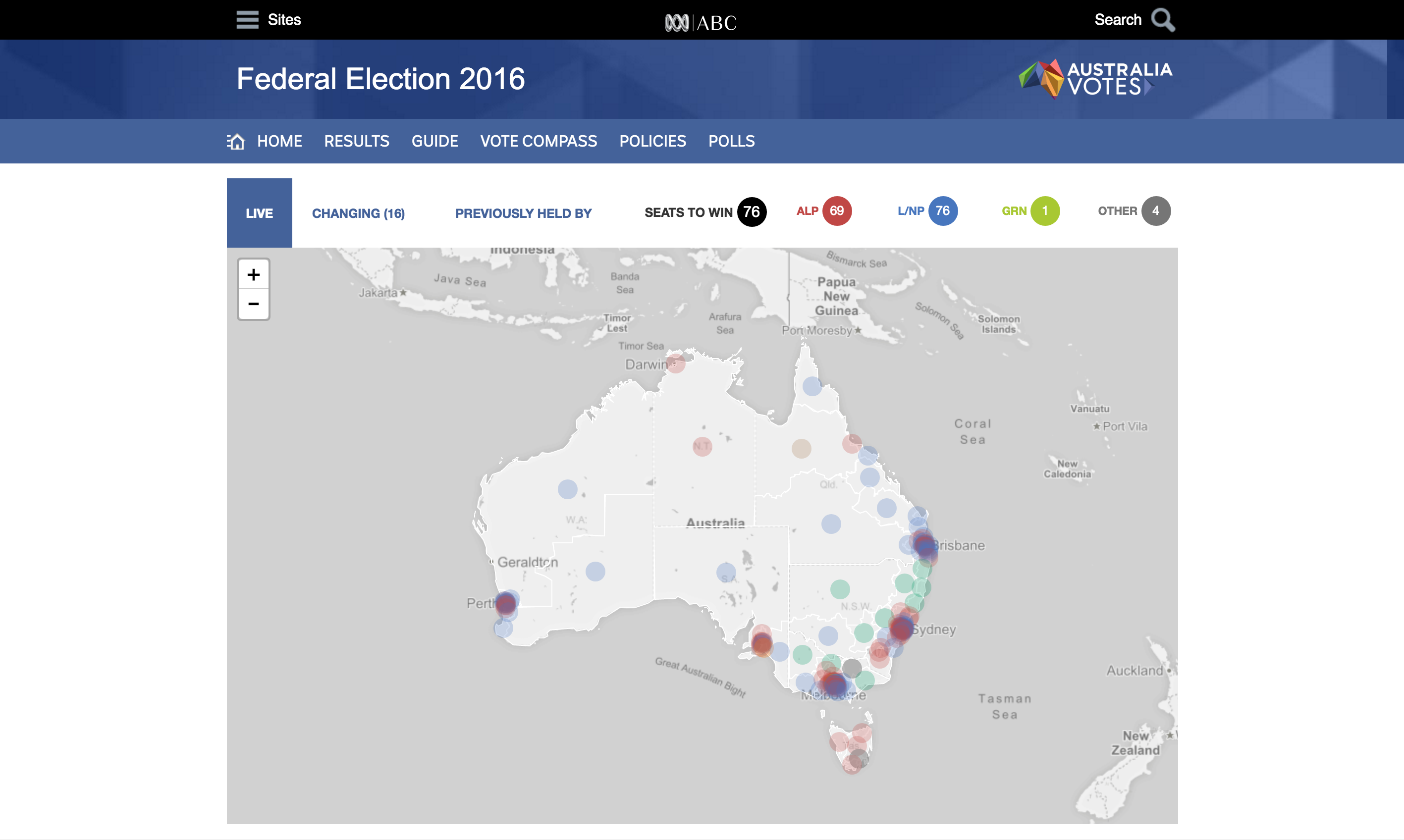
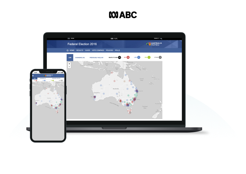
For the 2016 federal election, I designed and coded the ABC’s real-time electorate map, turning a desktop-only experience into one the whole country could follow from any device. Mobile usage tripled on election night.
01
Challenge
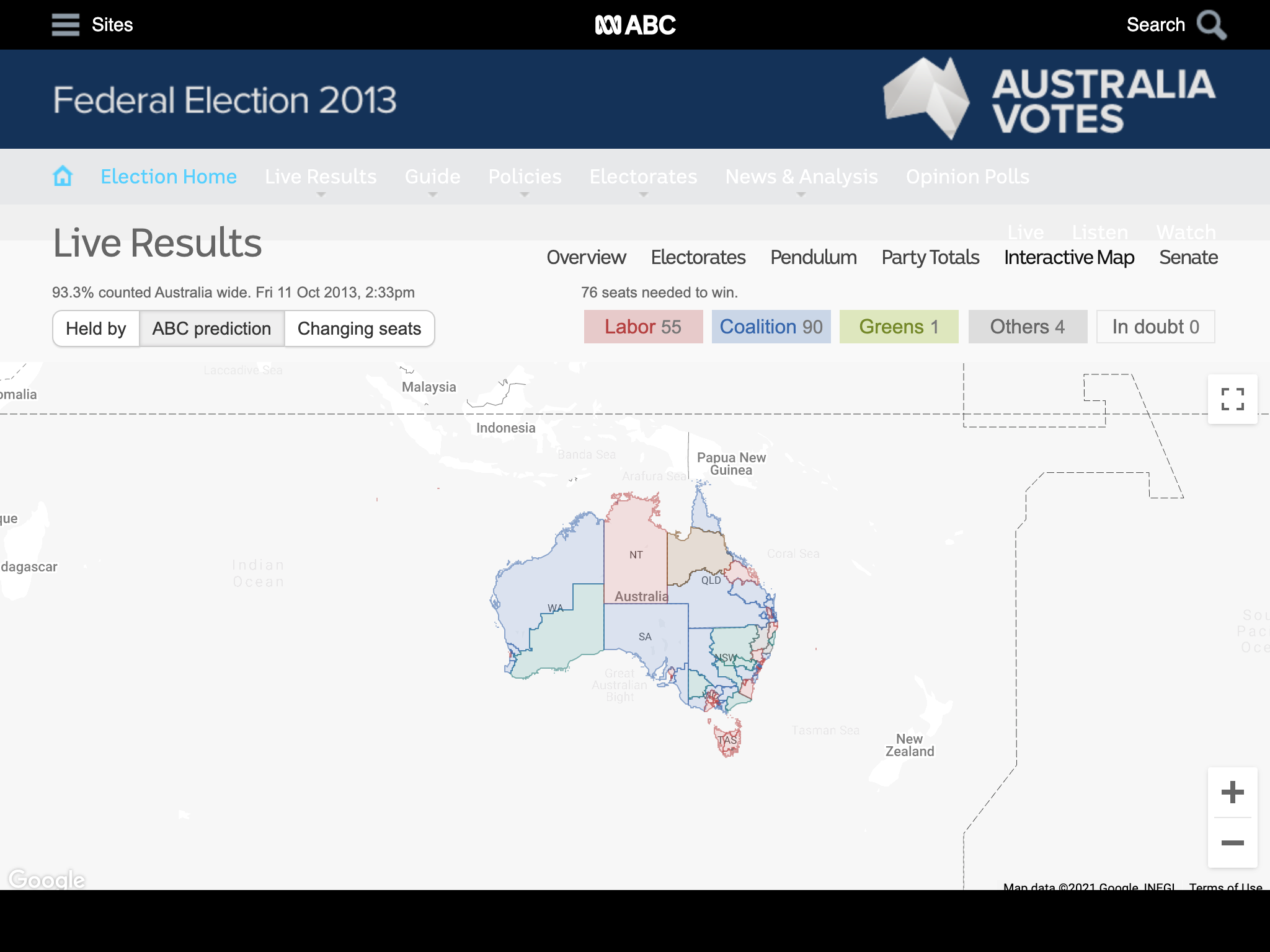
Before the redesign, the ABC’s election results map made one of the biggest nights in Australian news harder to follow than it should have been.
- Poor representation of electorate data: the existing map lacked clarity, making results difficult to interpret at a glance.
- Clunky experience: unintuitive navigation demanded excessive steps to find relevant information.
- Not responsive: designed primarily for large screens, the map was effectively inaccessible on mobile and tablet.
02
Approach
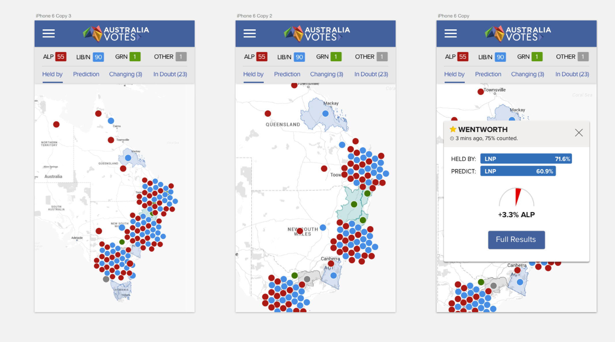
Even on a newsroom deadline, I made the case for validating designs before building them, grounding the map in real-world insights rather than assumptions.
- Sketching workshop: engaged key stakeholders to validate assumptions and uncover pain points, aligning everyone on the map’s design.
- Guerrilla usability testing: put electorate map designs in front of ABC staff and non-staff alike for fast, honest feedback.
03
Outcomes
On election night 2016, the new map let the whole country watch democracy happen in real time, on any screen.
3×
Mobile audience
Mobile audience for ABC’s election map tripled on election night.
- Enhanced engagement: increased time spent on the election coverage page.
- Improved accessibility: made election data digestible for a far wider audience.
- Seamless mobile experience: results available anytime, anywhere, tripling mobile users.
- Scalable solution: a reusable framework for future elections and political events.